
I rarely do more than one post in a day, but I decided to stamp a little this morning and do today’s Color Challenge on Splitcoast. The challenge today is monochromatic stamping. How could I resist that challenge? Of course, I’m still playing and if you can’t guess, I’m lovin’ this faux bleach technique!
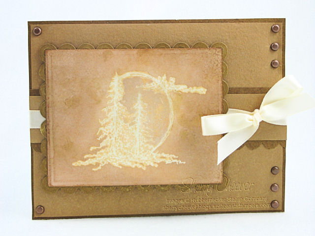
The image was stamped and embossed, and then background was misted with different combinations of distress pearlized mists. I even sprayed the background panels with the mists, but it’s a little hard to see in the photo. It’s really glittery in real life . . . as are my fingers! I even added a little Pearl Perfect Pearls on the sun to turn it into a moon!
- Stamps: KK Originals Trees Collection Serene Sunrise SKU:42-06 KK from Rubbernecker Stamp Company
- Paper: White Shipping Tag; Prism Tawny Medium and Dark
- Ink: Tsukineko VersaMark; Ranger Scattered Straw, Dried Marigold and Vintage Photo Distress
- Accessories: Ranger Mini Misters, Pearl and Gold Perfect Pearls, Perfect Medium, Super Fine Detail Clear EP, Inkssentials Blending Tool; Spellbinders Plain and Scalloped Rectangle Nestabilities; Iron; Brads; Ribbon
Don’t forget to check out the Treasure Hunt at Rubbernecker today. I’m also offering a chance to win some Rubbernecker Gift Certificates in my earlier post today.


I love this look and have to try out the technique!
Sherry,
This is very pretty! I really like the way you used the brads.
Take care and STAY POSITIVE!
I love monochromatic artwork! This is really cool. It looks like you’ve stamped on a piece of leather!
Looks like leather! (yeah…I’m still working on that THC…..I’ll get it done hopefully before the next one!! BWHAAAA)
WOW!!
I love the subtle colors that arose around the main image!!
Dreamy and soft–love how the ribbon looks with this too!
Yet another extraordinary design, by the *Badness* herself !
I think it would also blow your socks off if you made this on a darker CS (ie. forrest green) and displayed it as a Christmas card. OOOOOpppps, sorry, I said the *C* word, as in Christmas!@! EEEKkkk! My rule is to not discuss it ’til AFTER our Thanksgiving; in Canada that usually means in and around mid-October.
Incredible work Sherry~~ I guess the day of laying around on the couch napping, while being creatively stimulated by that murder//mystery marathon TV show (can’t think of the name at the moment!) has done you well! HA HA
Wowza! This is stunning, Sherry! 🙂 LOVE it! Hope you are doing well! 🙂
This is so gorgeous, Sherry! I love both the stamp and your card. The image seems to be lit from within. Wow!