Good morning y’all!  All weekend, I’ve been playing with Ken Oliver’s new product, Color Burst!  I have to admit that I messed with Color Burst a little at CHA, and watched Ken for hours making backgrounds (distress without the mess) and showing us the ins and outs of the product; but until I actually got it in hand and started playing with it myself . . . Well, Oh My BADness!

First thing that took me by surprise (and I truly can’t believe that it did), was that it’s a powder.  A very concentrated powder . . . why did I not realize this at CHA?  I have no earthly idea!!!  Maybe it was the fact that I watched Ken mist the paper and then sprinkle on the Color Burst . . . and it immediately burst into color all across the page.  Then he would mist it with water and it would spread even more . . . Yes, call me a ditz!  The first time I used it here at home, I had to ask my other teamies if mine had dried up or was it actually powder . . . okay slap my forehead!

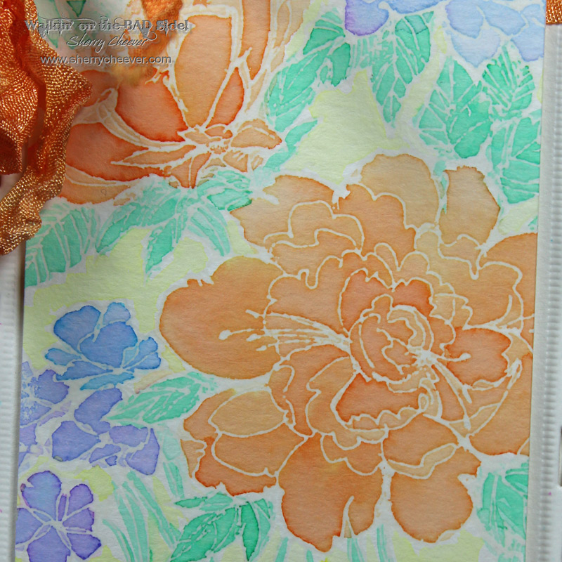
I know I’ve mentioned this here before, but the first few things that ran through my mind when I saw Ken work with Color Burst was Faux Batik and of course, distress without the mess.  One thing I played with this weekend was using Color Burst for a “Layered Textured Wash”.  I misted my craft sheet with water, sprinkled on the Color Burst, misted with water again and watched the color “burst” on the craft sheet.  I tried watercolor paper and then white coated tags.

988946_10153344923395839_1303161359888974131_n

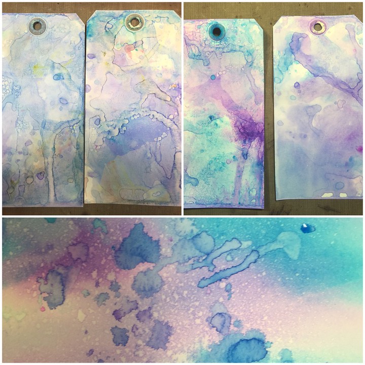
As I picked up color each time I was amazed that no matter how muddy my craft sheet looked (ink pooling all over the place), when dried on the paper the colors didn’t muddy!  I LOVE it!!!

One of the other things I thought of immediately was the Faux Batik Technique.  (That link is to an old tutorial I did using alcohol inks . . . I think I need an updated video!)

SpringGarden2

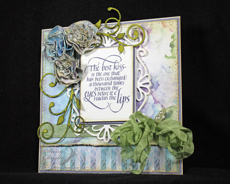
This card is really very simple to do.  The image was stamped with VersaMark on watercolor paper and embossed with clear embossing powder.  Using Color Burst to watercolor with, the image was watercolored and when dry, the embossing was removed with a craft iron (see tutorial or either video) creating the Faux Batik.

SpringGardenCloseUP

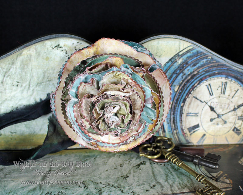
The seam binding was dyed with Orange Color Burst to match the color in the flowers.  I haven’t made any mists up yet, so I misted my craft sheet with water, sprinkled on the Orange Color Burst, misted with water again and dropped in my damp ribbon.  As I dried the seam binding, I continually picked up the color off the craft sheet.  Love all the shimmer and different shades achieved with the Color Burst!

SpringGarden

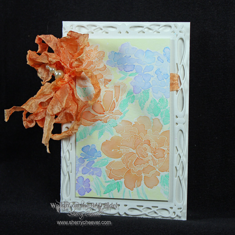
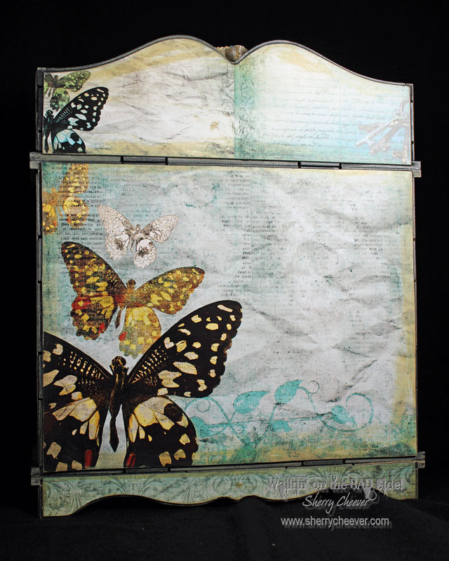
A background for the image was die cut/embossed from watercolor paper with Romantic Rectangles.  The image and the card base then trimmed to fit the die cut rectangle.

By the way, the stamp used is Stampendous Garden Background.  I’ve had it for a few years and when I searched for it online, it’s not on the Stampendous website.  I did however, find it at Frantic Stamper, Amazon and 123Stitch.

That’s it y’all!  Thanks for stopping by and visiting with me today!

SHERRY SIGNATURE


Project Supplies


Hey y’all!  Today I’m sharing a card over on the Quietfire Design blog using one of their new stamps, The Best Kiss.

KOCWatercolorKiss3

I made this card for Ken Oliver’s CHA Booth, and it also incorporates his new paper lines, Watercolor Memories and Pitter Patter Patterns.  I can’t say enough good things about these paper lines . . . Oh my BADness . . . they are an absolute joy to work with and this Watercolor Memories line is absolutely gorgeous!  He designed the Watercolor Memories line from photos that he had taken of different flowers around his hometown.  Each page/sheet/design is a work of art!

The dies used for this card are from Tonic Studios, which you’ll be hearing more about after CHA. Tonic’s dies have been in the UK Market for some time now, and at this CHA they will be introducing them to the US Market.  I know I’ll have more to report!  Stay tuned!!!!

Oh and before I forget, you can read more about this card and see more photos over on the Quietfire Creations Blog today!

Okay  . . . that’s all for today.  By the way, who’s going to CHA?  Leave me a comment if you are so I can make sure to give you a hug!

SHERRY SIGNATURE


Project Supplies:

Hello!  I have a second project to share that I created for Ken Oliver’s booth at CHA.  I’ve been racking what’s left of my brain for a project that would simply showcase Ken’s wonderful paper lines in his booth.  I finally stumbled upon some initials the other day and decided they would be perfect for Ken Oliver Crafts!

KOCInitials

Once I had the letters in my cart, I sent Ken a quick photo and asked what he thought . . .  a few laughs later, tears streaming down my cheeks, and the letters came home with me to be altered.

I have seen a number of projects focusing on Ken’s Hometown line, and wanted to do something with the reverse side of the popular images from his hometown of Newburgh, Indiana.

KOCCloseUP

I used the 6×6 papers for this project and they were a perfect match for the size of the letters, which I didn’t even measure before I purchased them.  The papers were glued to the letters, the excess was sanded off and then the edges were sponged with Ken’s new Walnut Ink.

One more thing before I go!

Ken Oliver Crafts

I’m very honored to announce that I’m a Style Contributor for Ken Oliver Crafts!  I’m so excited to be working with Ken, who is such an amazing artist and friend.  I also consider myself very lucky to be working with the other Style Contributors.  I guess you’ll have to check out Ken’s Blog, Ken’s World in Progress, and some of the other sneak peeks that have been shared on social media to find out who the others are . . , yes I know . . . Tease!

That’s all I have for today!  I still have a few special projects to share over the next few days so don’t be strangers!

SHERRY SIGNATURE

Wow have I been gone for a little bit.  Well, not really gone but not able to post much.  I hope everyone had a wonderful Christmas holiday and if you have the crud like the rest of us, it hit you after Christmas Day!

I’ve been busy in the studio, and have a number of things to show you . . .  now that the holidays are over . . . but first and foremost, I must show you some CHA projects I’ve been working on.

Today’s project is one I’ve worked on for my friend, Ken Oliver, using one of his new lines of paper and inks, which are premiering at CHA.

STUDIOCabinet

The paper used is Ken’s new line, Studio, and it features items that he has placed around his home and in his studio.  If you were one of the lucky one who attended  his Art at the Edge and went to visit his home, you’ll recognize some of the images in the papers.  Quite frankly, it’s quickly become one of my favorites!!

STUDIOCabinetSide

The storage unit is the Verona Creative Storage Kit in the Forever Moments line by Tonic Studios.  I will say that this storage kit is quite the endeavor, 2 or 3 days to paint and assemble . . . well at least for me . . . but I do believe it is well worth it in the end!

STUDIOCabinetBack

The flower in the center at the top was made from bits and scraps of the left over paper, using Tonic Studios Scalloped Circle Layering Die Set.

STUDIOCabinetFlower

I also need to mention that Ken’s papers come in 12×12 and 6×6, perfect for card makers and bigger projects, and it has a glossy finish making for a quite thick and sturdy sheet of paper!

STUDIOCabinetTopDown


So I think that’s all for me at this time!  Like I said earlier, I have so much to show you in the next few days . . . I’ll be back!

SHERRY SIGNATURE

© 2015 Suffusion theme by Sayontan Sinha