Hello and welcome to the second Design-abilities blog hop! We are the Spellbinders® Blog Team and we wanted to do something fresh, fun and creative to bring our team together. But before we get started we want to let you know this blog hop is just for fun and creative inspiration. We are not sponsored by Spellbinders Paper Arts®.
This is also the first hop that our new Blog Team Members will be participating in. If you missed the announcement on Friday that Darsie Bruno and Michelle Woerner have joined the Blog Team, you can find it here!
Sometimes we might not all be able to participate but we would still encourage you to visit all of the Blog Team Members and check out their blogs. You will find all kinds of ideas for die cutting, paper crafting, mixed media, DIY projects, jewelry, home decor, lots of tutorials and techniques. As designers we are always inspired by each other and we hope to inspire you too.
Including me, the Spellbinders Blog Team consists of:
My project today is something that I’ve had in mind for a month or more now . . . It was just finding the time to work on them! I need a few special gifts for the holidays (hostess, open houses, friends, etc.) and I’m hoping these will be perfect.
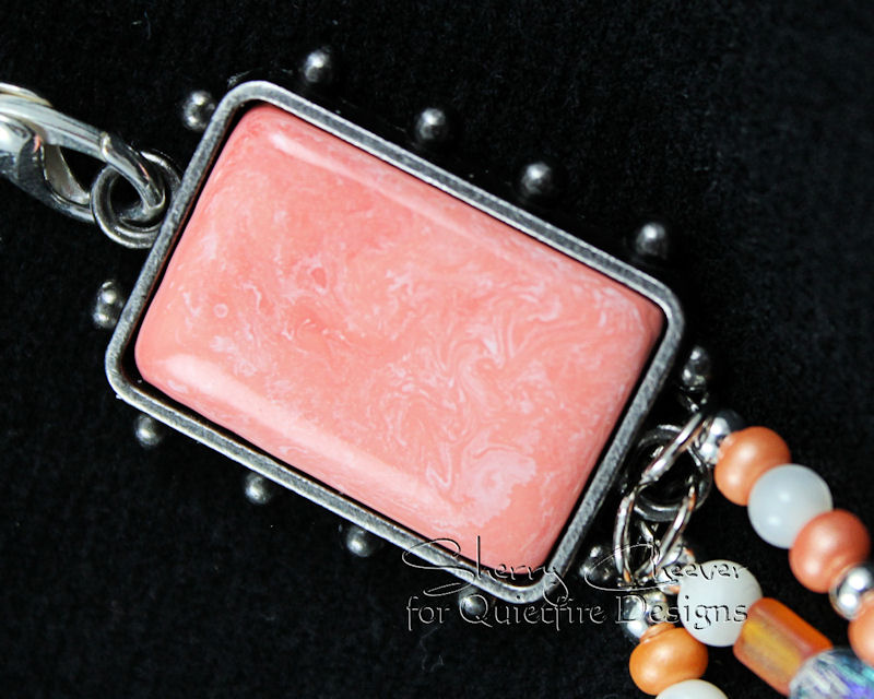
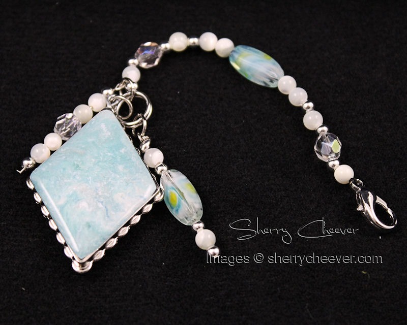
When I first thought about this projects, I first had in mind polymer clay. I even purchased some while at Michaels one day. Later it dawned on me that I since I had never worked with clay before, that I should stick with something that I had used often . . . Ultra Thick Embossing Enamel (UTEE).
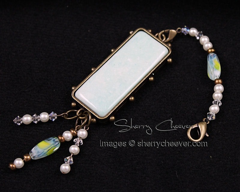
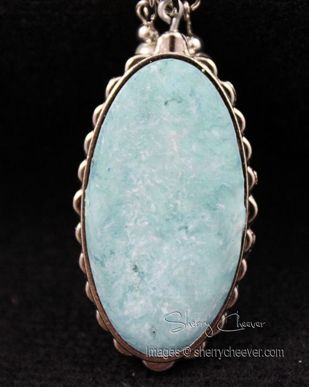
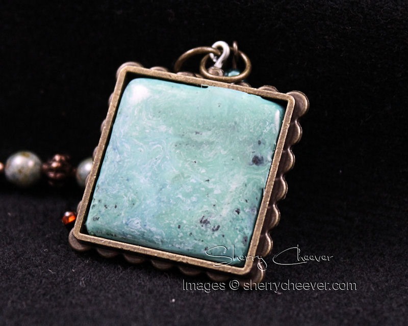
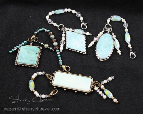
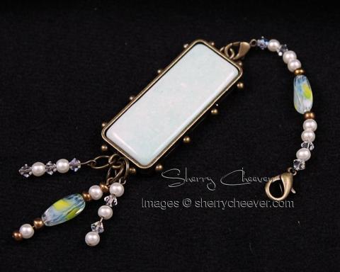
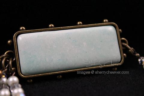
I began by adding clear UTEE in the melting pot. Once it was melted I added a small amount of white UTEE and let it melt thoroughly. Once all the UTEE was melted, I added drops of Turquoise, Jade and/or Coral Melt Art Heat It Inks. White UTEE was added to make the colors opaque as opposed to translucent. I think I ended up making 3 different pots of colors, pouring the mixes into various bezels/hat pins from the Spellbinders® Media Mixáge™ Line.
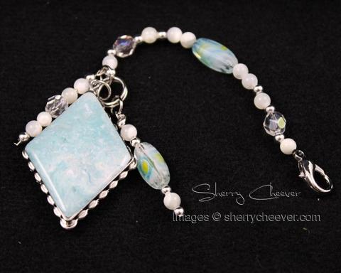
Beads were strung and added to the melt art pieces. If I used a hat pin, the wire was snipped off and looped at the base of the hat pin. Lobster claw clasps were used so these dangles could be hung from a key chain, a purse . . . or anywhere the recipient wished to hang them!
I loved the variations created by the colors added to the UTEE and hopefully you’ll be able to see them in the photos below.
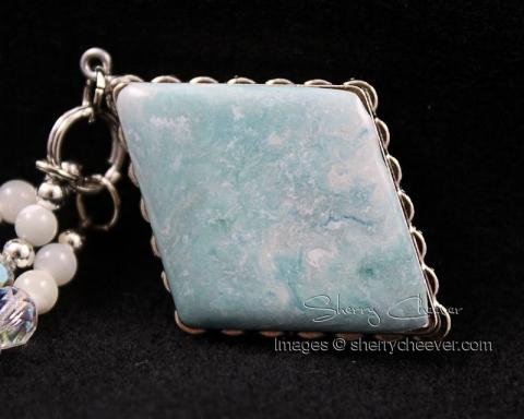
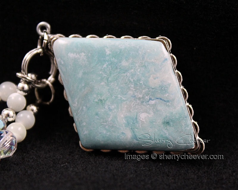
If air bubbles rose on the surface, I heated the UTEE with the heat tool to melt the UTEE again and cover in the holes.
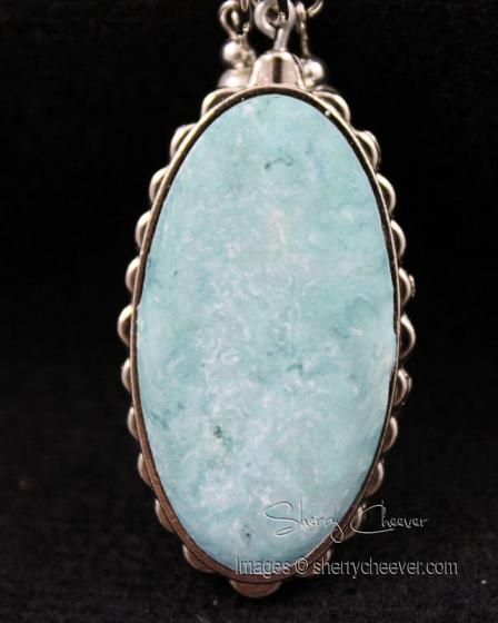
The best part of heating the UTEE again, was watching the different colors move about the bezel, creating more variation.
The darker lines are made by some of the Heat It Inks not being mixed entirely in the pot and then coming to the surface during the second, or even third, melting.

I have one still on my desk that had a speck of red (that I truly thought was blood from a cut on my finger) and when it was re-melted, it ended up being the coral additive. I’ll show that one to you later.
Needless to say, I had a great time making these and have plans for a few more . . . Melt Art is so darned addicting!
That’s all for me today! Don’t forget to visit the other Blog Team Members and see what inspiration they have for us today. I myself can’t wait to see what they’ve been up to!
Thanks for joining me!
Project Supplies: