You know how sometimes you start a project and it ends up something entirely different. This has happened quite often with me lately. I have one half assembled card and one colored image on my desk now that was supposed to be one card. I colored the image taking my colors with the designer paper I was going to use. I got my layout together, assembled the backgrounds, worked on my embellishments, and then when I laid the image on top – well, it really doesn’t work. I haven’t decided what I’m going to do yet. Replace the image with a sentiment or try the image anyway. There actually is a twist with the image and designer paper, which is why I chose it. Maybe it’s the embellishments I worked up that don’t work. I’ll keep looking at it for a day or so and try a few other things.


This same thing happened to me a few weeks ago. There was an inspiration challenge to make a card based on something in your home. I picked the framed quilt pieces in my stamp room. I had this idea that it would be cool to stamp out a heart, cut it up into 1″ squares and do an inchie heart. So that is exactly what I did. Then the heart was too big and overpowering for a card front. So I switched to a canvas. As I was standing there studying the canvas, the heart was too small. I needed to add more to it! I had just gotten some new sentiments that I pulled out, studied them and it hit me. I knew what to do! I stamped the same heart image on the grunge board and cut it out. Wings were added to the heart, sentiments were inked and stamped, and an old watch was torn apart. I think the watch may have been my dad’s or my grandfather’s. It was in a bag of old jewelry that my mother gave me some time back. The watch = TIME. Take TIME to

Take Time To Canvas

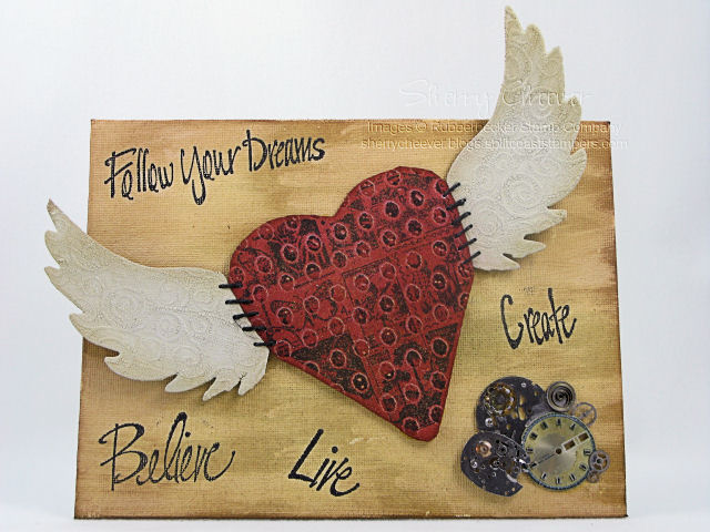
The canvas painted with a Ranger Lemonade Acrylic Paint Dauber and inked with Old Paper and Vintage Photo Distress Ink. The heart image was stamped in Vintage Photo on the Grunge Board and then cut out. The heart was then inked with Fired Brick Distress Ink and misted with Fired Brick – Gold Shimmer Mist. The Grunge Board wings were painted with a Snow Cap Acrylic Paint Dauber and then covered with Old Paper Crackle Paint.

Take Time To Wings

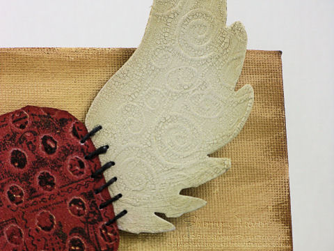
Once they were dry and cracked, the wings were then misted with Old Paper – Gold Shimmer Mist. To attach the wings to the heart, I punched holes on either side and stitched them together with black hemp twine.

Take Time to watch

The sentiments were stamped in Archival Jet Black in and the heart and watch parts were attached with Matte Accents.


Stamps: KK Originals Sentiment Collection Believe SKU:69-09 KK, Create SKU:69-07 KK, Follow Your Dreams SKU:69-10 KK, and Live SKU:69-17 KK; Stamp Oasis Graphics Collection Postage Heart SKU:1679 SO from Rubbernecker Stamp Company

Ink: Ranger Archival Jet Black, Tim Holtz Old Paper, Vintage Photo, Fired Brick and Worn Lipstick Distress Ink

Accessories: 6×8 Artist Canvas; Tim Holtz Grunge Board Basics and Elements; Ranger Snow Cap and Lemonade Acrylic Paint Daubers, Mini Mister, Gold Perfect Pearls, Matte Accents; Hole Punch; Black Hemp Twine; Old Timex Watch; Tsukineko Sponge Dauber

I hope you have a terrific day today! I’m heading out to spend some time with Mallory.

NEW SIG

I got a second wind this evening, plus a brain storm. Yes, it hurt! I actually took another 2 hour nap this afternoon and after dinner couldn’t help but head down to the rubber room. While at CHA, I was so taken with the Tim Holtz Idea-ology Booth — actually, I was mesmerized. There were flowers, grunge board flowers.

CHA Flowers

Ever since I saw them, I knew I had to try my hand at them. I went to Archivers last weekend and they actually had the Grunge Basics. I failed to pick some up in California to bring home. In the dollar bin, they also had a sheet of chipboard flower shapes that I knew I could use as a template. Here’s what I came up with tonight.

Art Journal

The journal is covered with BasicGrey Two Scoops designer paper that I sponged the edges with Vintage Photo Distress Ink. The flowers were cut from Basic Grunge Board. I used some chipboard flowers to trace around and then cut out. The flowers were sponged with Worn Lipstick and then highlighted pad to grunge with Fired Brick. To add some simmer to the flowers, I misted them with Dried Marigold-Gold Shimmer Mist. The leaves were just cut out of the Basic Grunge, sponged with Shabby Shutters, highlighted with Peeled Paint and then misted with Scattered Straw-Gold Shimmer Mist. The bottom grunge piece is from the Elements collection, was sponged with Worn Lipstick, highlighted with Vintage Photo and then misted with the Dried Marigold-Gold Shimmer Mist. The sentiment panel is also BasicGrey Two Scoops. I distressed the bottom layer and then sponged the edges with Vintage Photo. For the top layer, the sentiment was stamped and then the edges were sponged. When I got ready to assemble the layers of the flowers, I placed them how I wanted, and pierced down threw the button into and threw the layers of the Grunge. The ribbon was threaded through a needle and pulled through to tie the layers together with the button.

Stamps: Life Without Art Sentiment from Rubbernecker Stamp Company

Paper: BasicGrey Two Scoops

Ink: Tim Holtz Worn Lipstick, Fired Brick, Peeled Paint, Shabby Shutters and Vintage Photo Distress Inks

Accessories: Tim Holtz Scattered Straw and Dried Marigold Distress Reinkers, Basics and Elements Idea-ology Grunge Board, Distress Tool; Ranger Mini Mister, Gold Perfect Pearls, and Glossy Accents; Tsukineko Sponge Dauber; BasicGrey Two Scoops Button, Pink Ribbon, Piercing Tool

Good Saturday morning! It just dawned on me that we have another long Holiday weekend coming up – WOO HOO! I’ll be hiding in my stamp room trying to be creative! My first Stamp Club meeting of the year is next Saturday, I have new SU stamps not yet mounted and projects need to be planned. The same day the SU pre orders arrived, I also received my new Tim Holtz Anthology stamps. Which by the way, Rubbernecker Stamp Company currently has on sale!

Mallory was home the day the Anthology stamps arrived and needless to say, she went nuts over them. I also have had some Grunge Board around here for the last few weeks, which Mallory had already been into. Being my typical daughter, she wanted to know if I was going to make her a new journal to take back to school. The thought had crossed my mind, but her asking me to make one was just the push I needed. We sat down, discussed what colors she would like, and I went to work last night.

I think today, the first thing I will do is show you the products used to make the journal. This might turn into a mini tutorial of sorts and I would rather you know what is being used as we go along.

Dec 29

The list of what I used: Zutter Bind-it-All, 3/4″ Double OWire Binding, 7.5 x 5″ Chipboard Cover; Tim Holtz Distress Inks; Tsukineko Sponge Dauber; Tim Holtz Anthology Stamps, Tim Holtz Grunge Board Elements; White Cardstock; 6×9″ ruled writing tablet; and Mod Podge. (Most of these items you can find at My Favorite’s Page, and they also happen to be on sale.)

Anthology Journal Cover

To start, cut the white cardstock to size so that you have four pieces to cover the front and back of the chipboard covers. Using Dusty Concord, Weathered Wood and Broken China Distress Inks, work the color onto the white cardstock with a sponge dauber, and then sponged the edges with Black Soot Distress Ink. (You can find these specific techniques in my Distressing Tutorial). Once these pages have dried, stamp the main images randomly using Black Soot. To add more texture to the pages, stitching around the edges was done with black thread.

To begin preparing the journal, the edges of the cover were inked with the Black Soot Distress Ink and then sponged toward the middle of the cover. (Since this particular journal is not covered completely with designer paper, I did not want the edges of the covers to show.)

Adhere the paper to the covers using Mod Podge. A thin coat of Mod Podge was painted on the cover, the paper was placed on the cover and using a brayer, roll across the top of the paper to get out any air bubbles and to make sure that all edges of the paper are adhered. This is important when running a cover through the Bind-it-All, so that the paper around the punched holes doesn’t come loose.

If you like lined pages in a journal, you can trim down the pages of writing tablet. These pages were trimmed down to 7-1/4″ x 4-3/4″ so that they would fit in the journal, but not come out to the edges.

We are not ready to assemble the journal. I find it easiest to work in order and assemble in order. Starting with the back cover, and using the Cover setting [C] on the Bind-it-All, line up the cover, press down in the center and then punch the first set of holes. To continue along with the line of punching, set the Bind-it-All to the Continuous setting [B], line up the next to last-punched hole in the notch, and continue punching. It is important to line up the next to last-punched hole, leaving one at the end, so that the punching will be continuous. You’ll find that if you don’t do this, you will have a gap in the holes. (How do I know this, well – I’ve done it!) At this point, I go ahead and punch the front cover and set it aside.

For the inside pages, use the Inner Pages setting [D], butt the edge of the paper up to the end, press down in the center and punch the first set of holes. Continue punching the remaining holes using the Continuous setting [B] as with the covers.

Once all the pages are punched, assemble the journal back to front as it would look when bound. Now here is the important part – flip that back cover over to the front, just as you would if it was attached with the coils. So what you have in order is, inside back cover, outside front cover, lined pages. Now thread the binding through the pages so that the square edge is on your left. To bind the journal, set the Bind-it-All to the width of the bindings. For this journal, 3/4″ since we are using 3/4″ Owires. Hold the journal by the covers and pages, placing the Owires into the binding section. Gently press the down on the handle until you feel the Owires come together.

To finish the front of the journal, I picked the largest Skull and Cross-Bones from the Grunge Board and covered it with Weathered Gray Distress Ink. I worked the ink down into the grooves of the Grunge Board, and then scraped the Dusty Concord pad across the top to highlight the design in the Grunge.

And here’s a picture of the inside of journal.

Anthology Journal Inside

On Monday this week, I started a set of coasters. I’ve been wanting to make something new to hang on my plate rack, and the SCS Try a New Technique Challenge on Monday was perfect to get me going. I finished them up last night and thought I would share them with you today.
At first I thought I would stamp different trees on them all using different sets. However the more I thought about it, I stayed with Christmas in the City by Lizzie Anne Designs. Using the different images did make for a cute decoration. They will at least serve my purpose for a decoration this year.

On this one, I colored the images with Copic Markers and royalled messed up the mug. That is why you see those blue Stickles to cover up my mistakes. I stamped the skates on white, colored with Copics, trimmed them out and then ran embroidery floss through the skates to resemble shoe strings.
LAD Coaster Skates

To add some sparkle to the coaster, I colored the body of the snowman with a white paint pen and while it was still wet I sprinkled Ultra Fine Glitter on the paint. The sentiment was stamped and then punched out with the small oval punch. To add some highlight, I sponged the edges in distress ink and then mounted on Old Olive cardstock.

Coaster Snowman

For the window and wreath, I colored the image with Copics and then added Crystal Stickles on the window panes. Hope it looks frosty. The sentiment was stamped, trimmed down and the edges were sponged in distress ink.
LAD Coaster Wreath

Someone said they would like to see them all together hanging in the rack. Well, here’s a close up in the rack

Coaster Rack Closeup

And here is the final picture of the wall where the rack hangs.

Coaster Rack Full wall

The other day while blurfing, I stumbled upon a blog that had a link to Tim Holtz. Well, Tim Holtz has finally started blogging and it has become one of my daily fixes. He currently is showcasing the 12 Tags of Christmas. For 12 days he will be making Christmas tags, each different, and using different techniques. I have been so inspired by what he is doing. I had to try my own hand at it!

Natures Moment Tag

I started with a white tag, sponging on a background layer of Weathered Wood Distress Ink. The sentiment was stamped in Black Soot and then embossed in super fine Clear EP. YES, you can emboss with the Distress Inks. I continued to work the color onto the tag adding different layers of ink until I had the look I wanted to achieve. The flower stem was inked in Peeled Paint and then the flower sections were dabbed with Dusty Concord and stamped on the background. The hummingbird was stamped on the tag with Black Soot and then on a separate piece of cardstock with Walnut Stain. I added some Crystal Stickles and while they were drying, I worked on sponging color onto the hummingbird. The final image of the hummingbird was raised on mounting tape over the black image.

Stamps: Tim Holtz’ Collection Nature’s Moment by Stampers-Anonymous from Rubbernecker Stamp Company

Paper: White Tag, Neenah Classic Crest Solar White

Ink: Tim Holtz’ Fired Brick, Peeled Paint, Black Soot, Walnut Stain, Weathered Wood, Dusty Concord, Faded Jeans Distress Ink

Accessories: Ranger Clear Super Fine EP, Crystal Stickles, Cut-N-Dry Pen Nibs and Ink Blending Foam; Fibers; Mounting Tape

All products to complete this project can be found at Rubbernecker Stamp Company.

© 2015 Suffusion theme by Sayontan Sinha