Happy Tuesday! So it’s May, the 20th of May! That means that it’s time for another Dirty Girl Challenge. I have to say, that I am so enjoying these monthly challenges between the Splitcoaststampers Dirty Dozen Current and Alumni. For starters, it keeps us challenged, thus being creative, but it also brings us all together. Not only is that fabulous for us, but you also get to see some creative stamping by a very talented group of women. (I’m still asking myself why I’m in this group, but hey let’s enjoy the ride.)

This month’s challenge focus is on owls (or any other flighted fowl), to use texture, and no rhinestones, crystals, dew drops, or other blingy embellishments. To see all the challenge cards, you can search on Keyword DCWH508 in the Splitcoaststampers Gallery, or simply click here.

Now I’m just a little upset with myself on the image of this card, only because I got a little carried away with the airbrush and no matter what I did, I couldn’t correct it. I suppose I could have trashed it and started over, but that really was too simple.

DCWH508

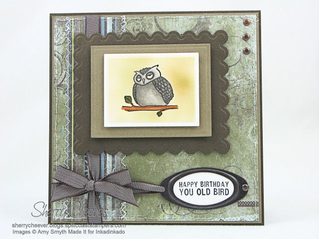
The image was colored with Copic Markers and then cut out and embossed using rectangle Nestabilities. I left the die cut in the rectangle, using it as a mask for the edges, and then masked the owl itself. I then airbrushed the background leaving a white band around the image. I then cut and embossed two more layers each larger than the other for the background of the image. The sentiment was stamped in black ink, and then punched out using the SU Large Oval Punch and adhered to the back of the Hodgepodge Hardware with Ranger Matte Accents. The background paper, BasicGrey Periphery was sewn to a panel of Prism Birchtone Medium which was then layered on the card.

My texture for the card would be the stitching, the Prism paper which has a rough texture on one side, the embossing the Spellbinders Nestabilities, the airbrush (which gives the paper a different feel), and the weave of the taffeta ribbon.

Stamps: Amy Smyth Made It – The Aviary Assortment for Inkadinkado

Paper: Neenah Classic Crest Solar White; BasicGrey Periphery; Prism Birchtone Medium and Dark

Ink: Tsukineko Brilliance Graphite Black and Ranger Archival Jet Black

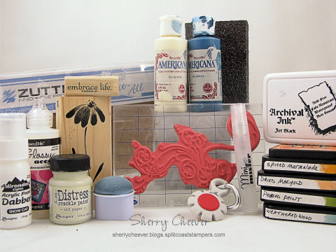
Accessories: Copic Markers and Airbrush System; Spellbinders Plain and Scalloped Rectangle Nestabilities; Sewing Machine; SU Hodgepodge Hardware and Chocolate Chip Taffeta Ribbon; Ranger Matte Accents; Mounting Tape

Here’s hoping each of you have a great day and enjoy looking at all the Dirty Dozen Challenge Cards!


NEW SIG

Good Sunday morning! It’s that time again, time for another Splitcoaststampers Dirty Dozen Challenge. This challenge is open to all current and alumni Dirty Dozen, and one that I enjoy participating in each month. This month the challenge was to make an Inspirational Journal using the following picture as inspiration.


Inspiration Photo


The inspirational photo is from BH&G 100 Decorating Ideas Under $100 magazine. We could choose to be inspired by the color pallette, the composition, or any other element of the photo that grabbed us. The restricted element for this challenge, was NO markers (including Copic, SU or any other brand) or watercolor crayons. I was immediately taken with the soft blue and white color scheme in the room. The next thing that jumped out at me were the flowers on the table and the oranges on the shelf. I decided to make my journal in blue and white, with just a small punch of orange.

DCI408

As you can see, I actually was inspired by one of my own creations as well. Yesterday I posted the journal that I made for the Lizzie Anne Designs April Project of the Month, which subsequently became my sister’s birthday present. This time, the journal is for me and the design on the POM Journal was one that I absolutely loved. Not only that, but since this journal is mine, I pulled out my favorite Penny Black floral stamp that I have not used in months and months and months. I won’t go into great detail in this post about making the journal (since I did that yesterday), but I will highlight some of the details.


I inked the flower image by tapping Distress Ink Pads directly onto the stamp. I then misted the image with water, and stamped it out three times on a piece of watercolor paper. Once the image was dry, I went back with a wet watercolor brush and pulled the ink into the open areas of the image. The edges of this panel were then sponged with Weathered Gray Distress Ink, completely into the image. Using a baby wipe, I then pulled some of the color off by wiping from the image out to the edges. I loved the effect I got, more of a watercolor look as opposed to sponging. The image was then layered onto solid colored designer paper and stitched together.


The covers for the journal were painted with acrylic paint, then highlighted with distress crackle paint. Once the crackle paint was dry, I went back and sanded all the edges to give the journal a worn look. As a last minute addition, I added the flourish to the all the covers and the inside pocket dividers. The flourish was stamped in white acrylic paint.

DCI408 INSIDE

I decided to separate the journal in two sections, divided by pocket dividers. The first section contains lined paper, and the second section is plain white cardstock.

DCI408 PRODUCT


Stamps: Penny Black Blush; Stampers Anonymous Tim Holtz Collection Anthology from Rubbernecker Stamp Company; and Stampin’ UP! Embrace Life

Paper: Canson Watercolor Paper; BasicGrey Periphery; Stampin’ UP Bashful Blue; Georgia Pacific White; Lined Memo Pad

Ink: Ranger Archival Jet Black, Tim Holtz Spiced Marmalade, Dried Marigold, Peeled Paint, Weathered Wood and Vintage Photo Distress Inks

Accessories: DecoArt Americana Blueberry and Buttermilk Acrylic Paints; Ranger Glossy Accents, Mini Mister, Snow Cap Acrylic Paint Dabber, Tim Holtz Old Paper Distress Crackle Paint; Sewing Machine; Zutter Bind-it-All, 7.5×5″ Craft Covers, 1″ Double O Wire; SU Hodgepodge Hardware; Tonic Tim Holtz Distress Tool; Sanding Block; Ribbon; Watercolor Brush

I hope you enjoy the rest of your weekend, and that perhaps you are inspired to make your own journal. If you would like to see all the journals made by the Dirty Dozen, all you need to do is click on this keyword, DCI408.

NEW SIG

Happy Thursday everyone! Just a quick update on the flooding. It rained all day yesterday and believe it or not, we also had a little bit of snow. Just 30 miles north of us, it was snowing. I spent the entire day yesterday, carpet cleaner in hand, suctioning out the water in my NEW stamp room. I hit it every hour on the hour and tried to stay on top of it. Last night when I went to bed the carpet squares and floor had started to dry out. Now, all eyes are on the Ohio River and what it is going to do. We’ve bothered Kate relentlessly – How many steps do you see now? What’s on the floor in the garage? This is Kate’s first year of living on the river but we’ve all been through it before. It never failed that when my parents were out of town, the garage would flood and we would be moving everything up into the upper levels. The river is supposed to crest on Friday morning, and I think we are going to be okay.

Enough of my babbles . . . .

Every month the Splitcoaststampers Dirty Dozen, current and alumni, get together and have a challenge among ourselves. This month the theme is Everything Old is New Again. The focus of the challenge is to use one of the oldest stamps sets we own along with long forgotten embellishments and supplies. Our restricted element is that we can’t use stamps, tools, or supplies that we have purchased within the last six months. Now there is a bonus challenge to use a technique or style we haven’t used in a long time, but was a favorite at some point in our stamping history.

I have to admit, that I made my card before I read all the restrictions and requirements – and what else is new? I seem to do that quite often! Or I read it, and forget it – uh huh, CRS! I got lucky – everything I used does stay within the guidelines. The only thing, if I had paid closer attention to the bonus part, I definitely would have done something different. I actually started another card, but I spent so much time messing with the water in the stamp room, that I never got it finished.

I used my most beloved, well-worn, and stained stamp set that I have. The one set that I’ll never part with no matter what. Roses in Winter! For my background stamping, I picked another favorite and rarely used set, Baroque Motifs. I rarely use my Stampin’ UP! Stamps anymore, and I hardly ever post them. I use them only for Stamp Club which meets every other month, and have only purchased – well, maybe five sets – from the last two catalogs.

DCON308

My background panel and image panel are both Very Vanilla. For the background, I stamped Baroque Motifs in Old Paper Distress Ink and then sponged the edges. This panel was then sewn to a panel of River Rock. I cut the image panels with oval Spellbinders Nestabilities (which I’ve had since they first came out) using my Cuttlebug. For the rose, I inked the image in Tattered Rose Distress Ink, and then rock and rolled (my technique I suppose) the stamp with Worn Lipstick Distress Ink. To add more definition to the petals, I edged the rim of the stamp with Fired Brick Distress Ink. All three images of the rose were inked in the same manner and stamped twice, rotating a quarter of turn with the second stamping. The edges of the Very Vanilla oval were sponged with Old Paper Distress Ink. The ribbon is from my scrap ribbon jar and the pin is something I found in my stash that I’m sure I probably purchased on clearance some time ago.

DCON308 Product

Stamps: Roses in Winter and Baroque Motifs from Stampin’ UP!

Paper: SU Very Vanilla and River Rock; Prism Herbal Garden Medium

Ink: Ranger Tim Holtz Tattered Rose, Worn Lipstick, Fired Brick, Old Paper, Peeled Paint and Shabby Shutters Distress Ink

Accessories: Oval Spellbinders Nestabilities; Cuttlebug; Sewing Machine; Tsukineko Sponge Dauber; Ribbon; Decorative Pin; Mounting Tape

One other required element of this month’s challenge, is to RAK any of the Dirty Girls. I haven’t decided yet, but it will go out in the mail today!

Hard to believe that it’s Friday already. I’ve spent everyday out shopping or running with the girls this week. I finally found some time to stamp last night and hopefully that’s what I’m going to be doing today! Don’t forget that I’ve got some Tawdry Treats for one lucky person and you have until Saturday morning to leave a comment. I’ll be posting Saturday morning who the lucky winner is and I’ll have some more exciting stuff for you then – you definitely want to check back on Saturday!

Last month, the Splitcoaststampers Dirty Dozen Alumni decided we would like to have a challenge using Elzybelles. It was so exciting, that past and present Dirty Girls wanted to play along. So now, each month there will be a special Dirty Dozen challenge including both current and alumni members. This month the challenge was penguins, with something icy, but no blue! You can see all the Challenge Cards uploaded this month here!

So here’s my penguin card, with something icy and nothing blue. I colored the penguin image with Copic Markers, stamped some flairs in the background that reminded me of waves, and my something icy are stickles on the surf board, in the bucket and on the ground. I wanted the sentiment “Dude, You Rock!” and had “You Rock!”, but in my laziness, I hand wrote Dude and then punched it out.

DCP1207 Penguin

Stamps: Penguin from Inky Antics; You Rock! Sentiment from Lizzie Anne Designs; Priceless from SU

Paper: Neenah Classic Crest Solar White, Real Red and Basic Gray

Ink: Real Red, Basic Gray, Tim Holtz Weathered Wood Distress Ink, Brilliance Graphite Black

Accessories: Copic Markers, Brads, Ribbon, Tsukineko Sponge Dauber, Mounting Tape, Ranger Frosted Ice Stickles, Small and Large Oval Punches

There’s been a challenge, a Dirty Challenge! Jami challenged the Dirty Dozen, current and alumni, to a challenge – upload a card using A Winter Song by Elzybells. We could use no patterned/designer paper (even though it might kill us in the process – she promised that if it didn’t, it would make us stronger) and to use the color, Pretty in Pink, somewhere in our design. For those of us who had not purchased the stamps, offers were made to get us images. I was lucky enough to be with Jeanne in Texas when her stamps arrived. I stamped some out before I left, so that I would have them when I got home.

The list of those Dirty Girls participating is amazing: Jami, SweetMissDaisy, kittie747, texasjdodylynn, Chantel, JanTInk, Lauraly, cookiestamper, waterchild12, StamperSharon, JulieHRR, genie1314, leigh obrien, Linda D, flaxychick, notimetostamp. 11Valerie11, mytime, rainy, debbiedesigns, Jeanne S, Duckwaddlequack, jbalcer, cwilliams, tayloredexpressions, LodiChick, atomicbutterfly, Zindorf, tashers, mel mel, WaterPixie, and rohla. Most of these girls have blogs and you will be able to find them in my blogroll. If they are not there, you can see them all on Splitcoaststampers. We’ve all used the keyword DCE1107 (Dirty Challenge Elzybells Nov ‘07).

What fun this card was to make. Some sponging, some glitter and bling, and stamping!

Dirty Dare

The image was stamped on watercolor paper and then colored with Adirondack reinkers. Crystal Stickles were applied to her coat and hat. The snow was made with Tulip White Puffy Paint and sprinkled with glitter while wet. The paint and glitter were allowed to dry until the very end of the card. I didn’t puff the paint until the card was completely finished so that I could manipulate the image and not flatten the poof! Liquid Pearls were applied to each scallop in the larger circle. The background panel was stamped using SU’s Snow Burst, and stamped in Pretty in Pink (there’s that pink) and Broken China Distress Ink. To add more bling to the background, the largest snowflake was stamped in Versamark and then embossed with Dazzling Diamond Dust. The edges of both the background panel and the main image were sponged with Broken China Distress Ink.

Stamps: SU Snow Burst, A Winter Song by Elzybell

Paper: Watercolor, Neenah Classic Crest Solar White, Tempting Turquoise

Ink: Pallet Noir Black, SU Pretty in Pink, Tim Holtz Broken China Distress Ink, Versamark

Accessories: Adirondack Reinkers, Watercolor Brushes, Tulip White Puffy Paint, Diamond Gold Ultra-Fine Glitter, Ranger Crystal Stickles and Liquid Pearls, Dazzling Diamond Dust EP, Ribbon, Heat Tool, Sponge Dauber

I hope everyone checks out all the other cards! WOW so much talent taking on a challenge!

© 2015 Suffusion theme by Sayontan Sinha