Hey it’s that time of the week again – time for the JBWW Challenge! It’s my turn to host this week, and I’ve got a sketch for you that is so much fun! You can showcase those little stamps in a set or you can create a background using any technique and go to town. I myself chose to use individual stamps. Remember to come back and post a link to either my blog or Jeanne’s blog, Inky Paws. Oh yeah, and don’t forget to use keyword JBWW if you upload to you SCS Gallery.

JBWW Sketch 5

Before I start with the deets of my sample card today, let me answer a question from yesterday. Julie (joypup on SCS) left this comment and question: “I love your card, Sherry! 3×3’s are dear to me, too… thanks for the heads up on the Distress reinkers — but could someone tell me why they are “distress” inks? What makes them special???”

I like the Tim Holtz Ranger Distress Reinkers and Pads because of the vibrant colors they have and the different tones they take when water coloring with them. Plus, you gotta love the names. If you have ever noticed when, water coloring with SU’s Classic Old Olive, the ink takes on different hues or tones. Well, all of the distress inks do, and the different hues they take on are so gorgeous. You can emboss with them as I found out this week, and they are the only ink that I distress the edges of my paper with. They stay wet a little longer than other dye inks and a little bit will go a long way. Here are a few facts about the Distress Inks that make them different from other inks and some of the reasons I like them:

  • The color is stable and maintains it’s integrity. They won’t fade over time or break down when wet. In other words, they won’t fade like other dye inks.
  • They are reactive with water, so when wet the inks actually travel out or “wick” across the surface. (I created a background panel the Friday where I completely soaked a piece of watercolor paper with water and dropped on little drop of reinker in the center. The ink spread completely across the panel. All I had to do then was take a wet paint brush and even out the color.)
  • They can also be used to tint black and white photos. As I said before, a little bit of ink goes a long way and using a Cut-N-Dry nib allows you to get into small detail areas with just a little bit of ink.

I think that above covers the distress inks but if you have any other questions, don’t hesitate to ask.

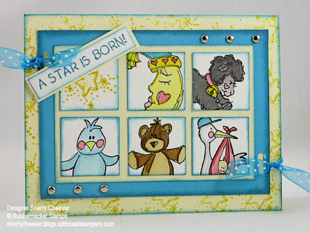
Moving on to my sample card today! As I said earlier in the post, I decided to watercolor my images today. All the images used are from Rubbernecker Stamp Company and are part of the baby collection.

RNS JBWW 5

I stamped each image on watercolor paper with Black Stazon and then painted the images. Well all except for the star square – I stamped that one. Using a 1-1/4″ square punch, I punched out the images and then sponged the edges with Broken China Distress Ink. To make the pattern of squares straight and even, I started with a larger piece of yellow cardstock and glued down the squares in the pattern eyeballing the space between the squares. This panel was then trimmed down leaving the same amount of space on the outer edges of the squares as on the inside. After the edges of this panel were sponged with the Distress Ink, I glued it down to a piece of turquoise cardstock. That cardstock was then trimmed to a 5/16th edge (I used my Perfect Layers for this). To add some dimension to the front of the card, I stamped the star image all over the front with Mustard Seed Distress Ink, and sponged the edges with Broken China. I added the brads to the main image panel and then placed it on the card front. (I didn’t want my brad butts to show – hehe). Using a slot punch, I punched two holes through all the panels and ran the ribbon through and tied it off. The sentiment was stamped out in the Broken China on watercolor paper, trimmed, sponged, mounted on turquoise cardstock and then placed on the top panel with a small piece of mounting tape.

Stamps: 88-01 Lamb, 88-13 Sleeping Moon, 88-09 Star is Born Text, 88-10 Stork, 88-06 Stuffed Bear, and 88-11 Stuffed Chick from Rubbernecker Stamp Company

Paper: Watercolor paper, Prism Iced Yellow, Turquoise

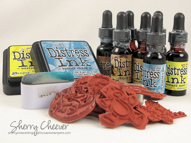
Ink: Stazon Black; Tim Holtz Ranger Broken China, Mustard Seed, Scattered Straw, Tattered Rose, Worn Lipstick, Black Soot, and Brushed Corduroy Distress Inks

Accessories: Watercolor Brushes, Perfect Layers, Brads, 1-1/4″ Square and slot punches, Tsukineko Oblong Sponge Dauber

Before I leave you today, and to follow along with the prior discussion of Distress Ink, these are all the products that I used today to make this card, and all of them can be found at Rubbernecker Stamp Company.

Baby Card Products

Nov 202007

With Christmas just around the corner, I know that a number of you have probably asked Santa for Copic Markers. I use the Copic Ciao Markers but have very recently purchased a number of Sketch along with the airbrush system. They haven’t arrived yet, but we can still talk colors. I’ve had a number of people ask me what colors I would choose if I had to get just a starter kit of markers. Well, I can’t do that! When I got my markers, I got them all at once. What I can do, however, is give you the numbers and colors that I use the most. I highly recommend going to the Copic website and request a color sample brochure. That’s one of the first things I did. It lists all the colors the markers come in and has a symbol chart for each specific type of marker. I don’t go shopping without it!

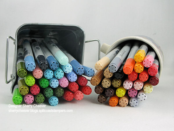
Here’s a picture of my favorite and most used colors:

cpoic colors

and they are:

Colorless Blender
100 Black

C-1 Cool Gray No. 1
C-3 Cool Gray No. 3
C-5 Cool Gray No. 5
E00 Skin White
E11 Barely Beige
E31 Brick Beige
E33 Sand
E35 Chamois
E37 Sepia
E57 Light Walnut
E77 Maroon
Y00 Barium Yellow
Y06 Yellow
Y17 Golden Yellow
Y28 Lionet Gold
Y38 Honey
YR16 Apricot
YR68 Orange
R05 Salmon Red
R11 Pale Cherry Pink
R17 Lipstick Orange
R35 Coral
R59 Cardinal
RV10 Pale Pink
RV13 Tender Pink
R22 Light Prawn
R27 Cadmium Red
R29 Lipstick Red
R37 Carmine
R46 Strong Red
R85 Rose Red
RV23 Pure Pink
RV29 Crimson
RV34 Dark Pink
RV42 Salmon Pink
YG23 New Leaf
YG67 Moss
YG95 Pale Olive
G07 Nile Green
G14 Apple Green
G94 Grayish Olive
G99 Olive
BG01 Aqua Blue
BG10 Cool Shadow
BG12 Aqua
BG96 Bush
B00 Frost Blue
B02 Robin’s Egg Blue
B12 Ice Blue
B32 Pale Blue
B45 Smoky Blue
B93 Light Crockery Blue
B95 Light Grayish Cobalt
B97 Night Blue
BV29 Slate

Even those these are the colors that I use the most, it doesn’t necessarily mean that these are the colors you will use. My recommendation would be to get 3 shades of the same color. You will need a light, medium and dark. I use the colorless blender only to correct any little boo boo’s that I make (coloring outside a line, a drop of ink, etc.) Prismacolor has a fabulous colorless blender pen that has a fine nib on one end that allows you to get close to the stamped image and in small places. I keep both the Copic and Prismacolor on hand at all times. I also use the BG10 Cool Shadow and the C-1 Cool Gray No 1 for any highlighting I might do around the image. If I feel the highlighting is bolder than I would like, I then use the colorless blender to tone it down.

I hope you’ve all been good girls and that Santa has been watching!

Hey it’s Wednesday already! I took the day off yesterday – well almost. I reorganized the stamp room one more time. I may get it right one day, but I highly doubt it. I just flat out need more room! As I wait patiently for one the kids to move out, I’ll have to make do. I found Mallory’s old iPod last night and got to messing with it. She was having trouble getting it to hold a charge, so at some point, we bought her a new one. So this one can be mine now. I’ve spent all morning uploading music, some of my blues and county tunes, and shhhhhh – don’t tell her — I deleted her rap! Anyhoo, the darn computer kept locking up on me, so I decided to make a card.

Because of my cleaning, errands, etc., yesterday, I let the color challenge slide. Actually, I just couldn’t come up with anything that was working for me either. When I saw the Sketch Challenge last night, still nothing came to mind. While I was messing with the computer this morning, I walked into the stamp room and guess what? Yep – something came to mind. Now don’t get overly thrilled, but I was happy that I got to fun stamp!

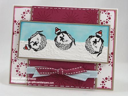
So, here’s my card for the Color Challenge and the Sketch Challenge on Splitcoast. It’s not often I get a double challenge in, but I’m still trying not to miss them.

SC150 CC140

The image of the ant was stamped out three times at different angles and colored with Copic Markers. There is just a bit of Tulip Crystal Glitter Paint on the trim of the hat and I painted on a layer of Tulip White Puffy Paint for the snow. I’ve not used Snow Burst much (once that I can remember for Stamp Club), so I grabbed it and stamped the snowflakes in Pomegranate.

Stamps: SU Snow Burst, Seasonal Inklings by G-Rated

Paper: Neenah Classic Crest Solar White, SU Kraft and Purely Pomegranate

Ink: Adirondack Pitch Black, Tim Holtz Broken China Distress Ink, SU Purely Pomegranate

Accessories: Copic Markers, Signo White Gel Pen, SU Double-Stitched Ribbon, Wedge Sponge, Mounting Tape

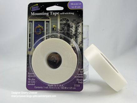
As I was typing Mounting Tape, it occurred to me that I’ve had a few questions about what I use. In the picture below are two different types of Mounting Tape.

Mounting Tape

The one on the left I buy at Meijers in the picture frame department. It’s called Magic Mounts and as is less than $2.00 for the package. It sticks well and doesn’t goo up your scissors, and comes in different widths. The one on the right – don’t waste your money. It’s made by Duck Brand Tapes. I found it in the hardware section of Meijers and it comes off easily, goos up your scissors and this will be the last that I purchase. I do prefer Scotch brand mounting tape, but only if I can get it on clearance or on sale. The last little bit I had, got taken to Jeanne’s and I think it still might be there. I keep looking for different brands, and trying them. If I come across another that I like as well as the Magic Mounts, I’ll let you know. I see on the package that Magic Mount is a product of Miller Studio, Inc.

Good morning ya’ll! It’s Friday already and I have one heck of a busy day in front of me. I still haven’t prepared for Stamp Club tomorrow, so that is a must do today. It also occurred to me last night at midnight that I have an appointment today at 2:00. Good thing I remembered! Sometimes the memory doesn’t fail me . . .

Today is the Limited Supply Challenge on Splitcoast. It’s a follow the list challenge: animals or critters, sentiment, background, 2-4 layers, any solid or patterned paper, coloring tools, punches, any other quick tool. Now the kicker for me was NO EMBELLISHMENTS. Let me just say that when I saw THAT . . . well I almost . . .

LSC141

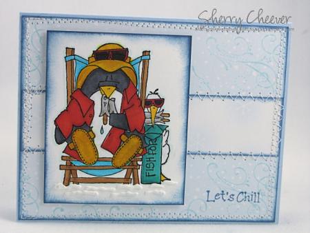
Here you have it, a 4-layer card. The cute little penguin was colored with Copic Markers and just a little snow was added with puffy paint. Now before you jump up and down, I consider this ink/paint, puffed with a heat tool. Quick! The patterned paper (Memory Box that I got from Sweet and Sassy Crafts), was sewn to the actual card front (quick and easy for me) because someone has run out of tape. (A quick trip to Sam’s Club is in order today.) The sentiment and the sponging were done with distress ink and I highlighted the image heavy to eliminate a background layer. The image is raised on mounting tape, to add some dimension. Ah the background, I used the flair stamp from Priceless stamped in Adirondack Aqua (and actually stamped after the card was put together – cause, well I forgot about the background stamp).

Stamps: SU Priceless, Penguin and Sentiment from Inky Antics

Paper: SU Bashful Blue, Neenah Classic Crest Solar White, Memory Box Snow Collection

Ink: Adirondack Pitch Black and Aqua, Tim Holtz Faded Jeans Distress Ink, Tulip White Puffy Paint

Accessories: Copic Markers, Sewing Machine, Sponge Dauber, Heat Gun

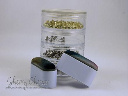
Let’s talk tools for a minute. When I was at Stampfest in Orlando, I picked up a couple of Tsukineko oblong sponge daubers.

Oblong Daubers

Jeanne and I walked for two days trying to find these and at the very end of the show, we did. Only too late – they were practically sold out and I was only able to get 2. I picked one up the other day to use and can I say – THEM! My fingers fit perfectly inside so there is some leverage, I can work different colors from one dauber using both ends, and they are washable. I NEED more!!! Before you ask, the container for brads is from the Target $ Spot. I’ve been using the container to prop up card fronts. I’ve making card fronts for a project and well, they just don’t want to stand on their own. I didn’t want to move it because it is in the perfect spot for lighting right now.

Hope everyone has a great weekend!

© 2015 Suffusion theme by Sayontan Sinha