
Good morning! Are you ready for a Color Challenge? Starla challenged the Just For Fun® Design Team to use the colors

We hope you’ll join us in playing along in the challenge and post a link to your project on the Just For Fun® Blog. To gather more inspiration, and I know there’s plenty, don’t forget to visit the blogs of the other JFF Designers participating today:
Broni Holcombe
Heidi Blankenship
Kat Tucker
Linda Duke
Sandy Sandrus
Starla Nelson
Terre Fry
Just For Fun® Blog
Now for my card! This was a fun one to work on if I must say so myself and I loved the colors that Starla challenged us to use.
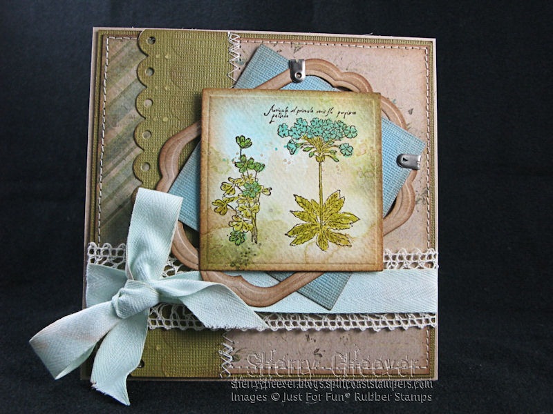
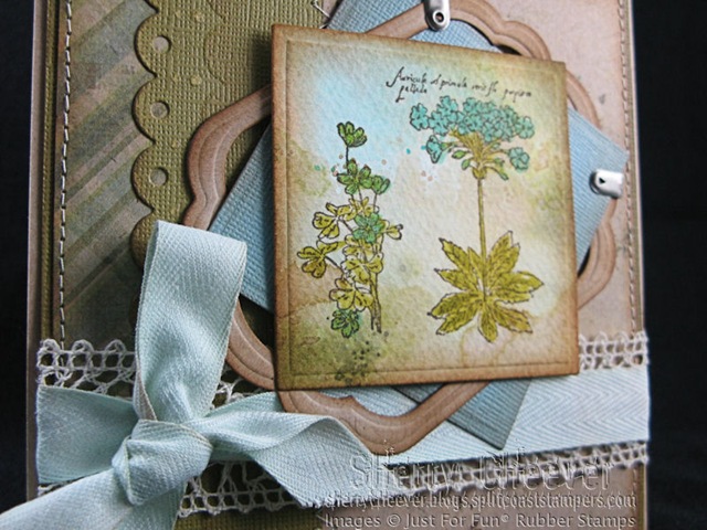
For the image panel, I started with Wrinkle-Free Distress and used watercolor paper. Once I had the background look I wanted, I stamped the image in Archival Coffee. To enhance the image, I water colored the flowers a little darker than the background. I couldn’t help but sponge the edges of all the paper and sew the background onto another panel. Not being one to let it go, I then added some layers behind the image.

I wanted my ribbon to be a little dirty and not so frilly for this card. I ended up dying some May Arts Ribbon White Twill with Tumbled Glass Distress Ink and water. After the twill was dry, I felt it needed to be more shabby so I swiped some Vintage Photo along the twill and rubbed it in. Now that was fun!
- Stamps: E2516 Botanical from Just For Fun® Rubber Stamps
- Ink: Ranger Archival Coffee and Vintage Photo, Forest Moss and Tumbled Glass Distress
- Paper: Watercolor; Core’dinations Tank and Tidal Wave; My Mind’s Eye Life Stories “Antique Flowers” and “Green Plaid”
- Accessories: Spellbinders™ S4-128 Classic Squares – Small, S4-126 Classic Squares – Large, S4-246 Labels Eleven and S4-239 Classic Scalloped Borderabilities Petite; May Arts Ribbon – 1.25” Ivory Crochet Lace and 5/8” White Twill from Stamp Simply Ribbon Store; Ranger Non-Stick Craft Sheet, Mini Mister; 7 Gypsies Antique Silver Paper Fasteners; Sewing Machine
That’s all I have for today, except I sure hope you play along with the JFF Designers in the Color Challenge. Check it out on the Just For Fun® Blog!
Thanks for stopping by and remember . . . life is short, make each day count and enjoy the adventures the day brings you!


Very Nice! Good job!!
Ooooh, looks like a great color combo to work with. Will have to add that to my list of things to do tonight when I go play after work! Gorgeous card…love the random look of your layers and the fab details!!
Gorgeous! Once again, it’s not too much, not too little, it’s just right. How do you do that?!? Well, however you manage it, please keep on sharing the beautiful results!
Beautiful!!
Wow!! I really expected to scroll down and see a very masculine card.Was I impressed with your creation!!!! Thanks for sharing!!! :o)
Beautiful card Sherry, great colors to work with. It’s done in the Sherry distress in a feminine fashion. Great composition. As always TFS!!! 😀
Beatiful!
Smiles~
Marilyn
Love the layers….padawon needs to work on that!! And the wrinkle free distress on watercolor….my attempt at that didn’t turn out so good!! LOL
very pretty colors and so love your layering and shading!
Hi Sherry –
What a great color combination and I think you’ve done a super job at interpreting it! I love it!
Elaine Allen
This is a beautiful card, Sherry, and I love how you dyed the ribbon to match the piece, very clever!
The bold versions of these colours did nothing for me, then I scrolled down and wow! these colours are surprisingly lovely together, softer and gentle to look at. Another very lovely, pretty card Sherry,
tfs
Alexandra
I so love how you used such soft shades of the brown and blue, and the framing you’ve created is beautiful!! What a yummy card!!
Great card — love all your shabby techniques!!!